Getting your artwork right before it goes to print is one of those things that sounds simple until it isn’t. We see the same issues come through every week, and almost all of them are avoidable. This guide covers the four areas that trip people up most often: colour modes, bleed and margins, resolution, and the common mistakes that lead to jobs being delayed or reprinted.
Whether you’re putting together your first set of business cards or ordering your hundredth batch of leaflets, this should answer most of the questions you’d otherwise have to ring us about.
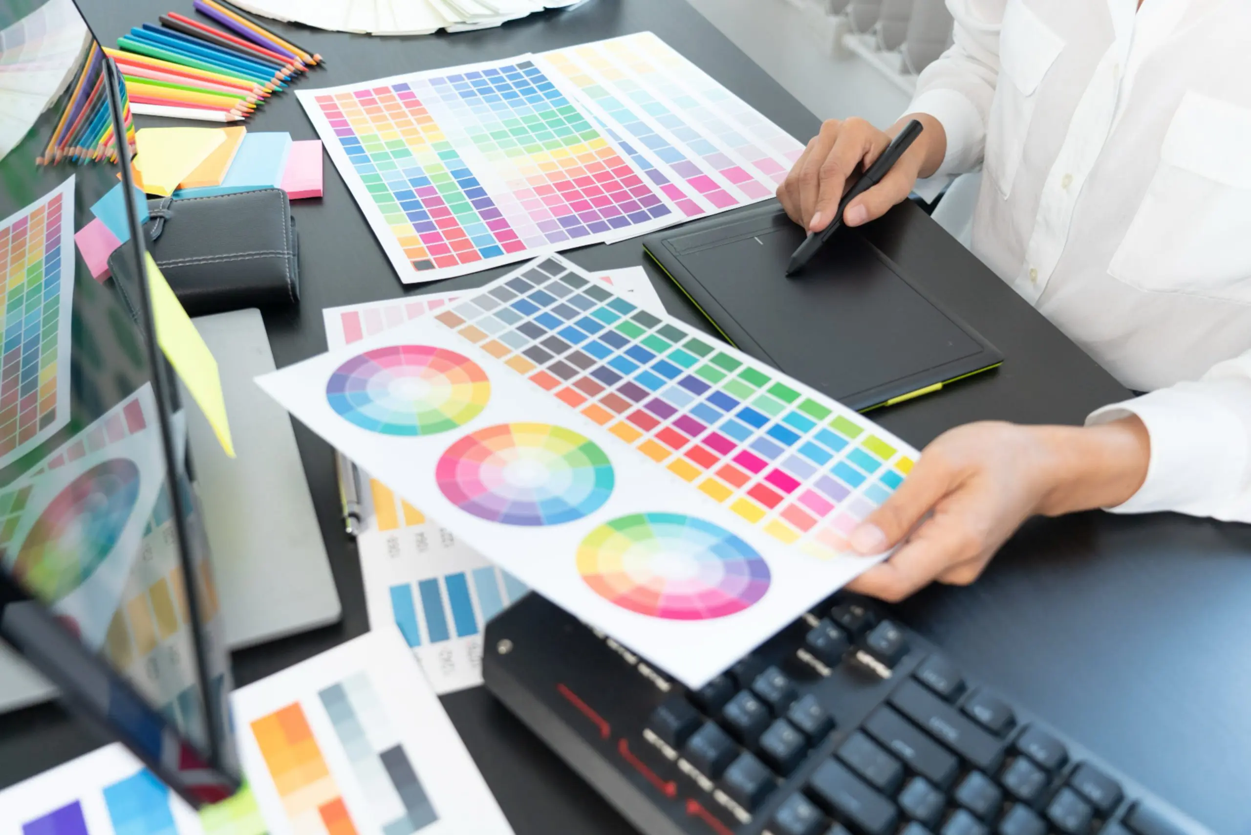
CMYK vs RGB: why it matters for print
Most people design on screens, and screens use RGB (red, green, blue) to produce colour. It’s a light-based system and it’s brilliant for anything that lives on a monitor. Print is different. Printers use CMYK (cyan, magenta, yellow and black) inks, and the two systems don’t map to each other perfectly.
If you send us an RGB file, we’ll convert it before printing, but the colours you get may not match what you saw on screen. Blues can shift, bright oranges can go muddy, and neons often look flat. The safest thing is to set up your artwork in CMYK from the start.
What to do
- If you’re using Adobe Illustrator, InDesign or Photoshop, change the colour mode to CMYK before you start. In Illustrator: File > Document Colour Mode > CMYK.
- If you’re using Canva or a similar browser-based tool, be aware that it works in RGB. We can still print from it, but colours may shift. If your brand colours are critical, speak to us first.
- For brand colours, ask your designer for the CMYK breakdown and use those exact values rather than just picking what looks right on screen.
Worth knowing: Screens are backlit, which makes colours look brighter than they are on paper. Even a well-prepared CMYK file can look slightly different to the screen version. A printed proof is always the most reliable way to check if colour matching is critical to you.
Bleed and margins: giving print room to breathe
Bleed is the area of your design that extends beyond the finished size of the printed item. When print is trimmed to size, even a very small variation in where the blade cuts can leave a thin white edge along one side if there’s no bleed. Adding bleed means your background colours or images run all the way to the edge without any risk of that happening.
Margins (sometimes called safe zones) are the opposite problem. If you put important content too close to the edge of your design, it can get trimmed off. Text, logos and anything else that matters should sit well inside the trim line.
Standard bleed and margin settings
- Bleed: 3mm on all sides (for most standard print items)
- Safe zone for text and logos: at least 5mm from the trim edge
- For larger format items such as banners or exhibition displays, bleed requirements may be bigger. We’ll tell you when that applies.
To set up bleed in InDesign, go to File > Document Setup and enter 3mm in the bleed fields. In Illustrator, use the artboard settings. When you export your PDF, make sure “Use document bleed settings” is ticked.
A quick way to check: Look at the edges of your design. If the background is white right to the edge and white is not intentional, you almost certainly need bleed. If your logo or any text is within 5mm of the edge, move it in.
Resolution: why 72dpi looks terrible in print
Resolution is measured in dots per inch (dpi) and determines how much detail an image contains. Screens typically display at 72 or 96dpi, which looks fine on a monitor. Print needs at least 300dpi at the size you’re printing to look sharp.
The issue is that you can’t fix a low-resolution image by just increasing the dpi setting in Photoshop. That tells the software to print it at a larger size, or it tries to invent detail that isn’t there, and the result is a blurry or pixelated image.
The original image has to contain enough data in the first place. If you grabbed a logo from a website, or used a photo from a mobile phone text conversation rather than the original file, there’s a decent chance it won’t be sharp enough to print at a useful size.
How to check
- In Photoshop: go to Image > Image Size. Make sure “Resample” is unticked, then set the resolution to 300. The width and height shown are the maximum size you can print that image clearly.
- For logos, always try to get an EPS or vector file (.ai, .eps, .svg) from your designer. These scale to any size without any loss of quality.
- If you’re using your own photos, shoot at the highest quality your camera allows and transfer the original files, not compressed copies from a messaging app.
Vector vs raster: Photographs are raster files (made of pixels) and need to be 300dpi. Logos and illustrations created in Illustrator are usually vector files and can be scaled to any size without worrying about resolution.
Common mistakes and how to avoid them
These are the issues we see most often. None of them are complicated to fix, but they do delay jobs when we catch them late.
Fonts not embedded or outlined
If your PDF still contains live text and we don’t have the font you used, it substitutes a different one. The result can look very different to your design. Before exporting your PDF, either embed the fonts (this happens automatically in most PDF export settings) or convert all text to outlines first. In Illustrator: Type > Create Outlines.
Using a low-resolution logo
A lot of businesses have their logo saved as a tiny PNG or JPEG and use it everywhere. It might look fine on social media, but it can look soft or pixelated in print. Ask your original designer for the vector file. If that’s not possible, talk to us and we may be able to help.
Wrong file format
For most print jobs, we ask for a print-ready PDF. This should have bleed included, fonts embedded or outlined, and colours in CMYK. Sending a Word document, a Canva link or a low-resolution JPEG usually adds a round of back-and-forth before we can print. A PDF gets the job moving faster.
Text too close to the edge
It’s surprisingly easy to design something where the text looks perfectly placed on screen but ends up right on the trim line when printed. Use the 5mm safe zone rule and you’ll avoid this.
Assuming what you see on screen is what you’ll get
Screens and print use completely different colour systems, different light sources and different materials. What looks like a deep navy on your monitor might print closer to black. If colour accuracy matters to you, ask us about a proof before we run the full job.
A quick pre-flight checklist
- Artwork is set up in CMYK
- Resolution is 300dpi at the intended print size
- Bleed is 3mm on all sides
- Text and logos are at least 5mm from the trim edge
- Fonts are embedded or outlined
- File is saved as a print-ready PDF
- Any images used are the original high-resolution versions
Ready to get started? We can help.
If you’d like a copy of our full artwork checklist to keep handy, just ask and we’ll send one over.
Or, if you’d rather skip the guesswork, send us your file and we’ll give it a quick check before it goes to press. It’s something we do every day, and it saves a lot of back-and-forth.
Email your artwork or any questions to: nikki@printsavegroup.com
We’re always happy to take a look.
Nikki & the Printsave Group team